When faced with a new dataset, one of the first impulses is to get it into Excel to get a feel for it. Occasionally the data set is too tall (too many rows) or too wide (too many columns) to effectively pull into Excel for quick and easy manipulation.
If you’re lucky enough to have access to QlikView, you can make this task straightforward for almost any dataset using the following technique.
After going through this 20 minute exercise in QlikView, you’ll have a new skill at your disposal that users will love. Using conditional expressions to match the available defined measures and dimensions in the dataset, we can make selections to display only those dimensions and measures of interest.
Load the dataset
For our example, we’ll use an income demographics data set found online from University of California, Irvine. While this dataset isn’t huge, it provides for a manageable demonstration of the technique.
LOAD @1 as Age,
@2 as WorkClass,
@4 as Education,
@5 as EducationNum,
@6 as MaritalStatus,
@7 as Occupation,
@8 as Relationship,
@9 as Race,
@10 as Gender,
@11 as CapitalGain,
@12 as CapitalLoss,
@13 as HoursWorkedPerWeek,
@14 as NativeCountry,
@15 as AnnualGrossIncome
FROM
[http://archive.ics.uci.edu/ml/machine-learning-databases/adult/adult.data]
(txt, codepage is 1252, no labels, delimiter is ‘,’, msq);
Arrange your dataset on the Tab
Place all of the measures and dimensions into a straight table chart. This can later be made into a pivot table or other chart, but keeping it as a Straight Table will simplify things for the implementation.
- Add and format all measures as expressions to your Chart Straight Table object.
- AVG(Age) as Avg Age
- AVG(CapitalGain) as Avg Capital Gain
- AVG(CapitalLoss) as Avg Capital Loss
- AVG(HoursWorkedPerWeek) as Avg Hrs/Wk
- Add all dimensions to your Chart Straight Table object (remaining fields as well as Age)
Generate Dimension and Measure Lists
In the script, generate inline table lists for your dimensions and measures to be selectively shown/hidden. Names used here should match the names of the dimensions and measure expressions defined in your chart object.
Dimensions:
Load * Inline [
Dimensions
AnnualGrossIncome
Age
WorkClass
Education
EducationNum
MaritalStatus
Occupation
Relationship
Race
Gender
NativeCountry
];
Measures:
Load * Inline [
Measures
Avg Age
Avg Capital Gain
Avg Capital Loss
Avg Hrs/Wk
];
Arrange Tab Objects
Add the following objects to your QlikView tab:
- Current Selections
- List Box for Dimensions
- List Box for Measures
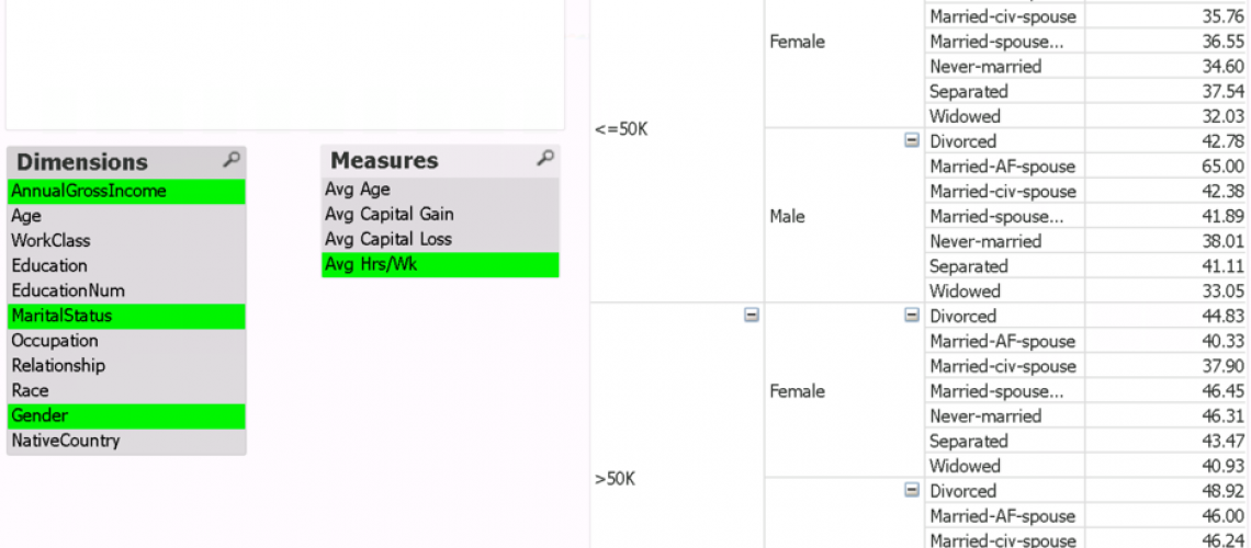
Your application tab should have the objects above looking something like this (table image is cut-off for size):
Apply Conditional Expressions
For each Dimension, do the following:
- In the Chart Straight Table Properties, select the ‘Dimensions’ Tab.
- Select a dimension in the ‘Used Dimensions’ box.
- Immediately under the ‘Used Dimensions’ box, select ‘Enable Conditional’ and input the following expression substituting the selected dimension value for ‘Age’:
SubStringCount(concat(Dimensions,’|’),’Age’)>0
Explanation: This expression concatenates all available ‘Dimensions’ values with a pipe delimiter and checks for the presence of the string specified.
Repeat the above for each Dimension substituting the appropriate dimensional values in each.
Next, we’ll do something similar for each measure.
- In the Chart Straight Table Properties, select the ‘Expressions’ Tab.
- Select the Measure expression on the left, then select ‘Conditional’ on the right hand side of the pane and input the following expression substituting the selected dimension value for ‘Avg Age’:
SubStringCount(concat(Measures,’|’),’Avg Age’)>0
Repeat the above for each Measure expression substituting the appropriate measure values in each.
Explore
You’re now ready to explore the data! Selecting one or more dimensions and one or measures will now filter the Straight Table Chart to give an analysis of only that selection set.
Make Necessary Modifications
You may notice a couple of issues at this point.
Firstly, if all selections are removed, Qlik treats the table as if all selections were made. This is the default Qlik behavior, however we can correct this by heading to the Chart Straight Table properties > General Tab.
Here you’ll find the ‘Calculation Condition’ box in which we can place the following condition expression, effectively hiding the results until a selection for a dimension and measures are made.
GetSelectedCount(Measures)>0 AND GetSelectedCount(Dimensions)>0
Secondly, if you looked carefully, you’ll notice that the ‘Education’ dimension remains when selecting ‘EducationNum’. This happens because the text, ‘Education’, matches for both selections.
To correct this issue, you must make each selection entirely unique somehow. My preferred solution to this is to always add a delimiter to the end of the concatenated dimensions, even if only one is selected, as well as the search criteria. This should optimally be done in each expression for symmetry and completeness, but in our example case it need only be done on the ‘Education’ dimension.
SubStringCount(concat(Dimensions,’|’)&’|’,’Education’&’|’)>0
You can now play with other Qlik Chart functions like Fast Switching to enable a Pivot Table or Chart.
In summary, this is a very handy technique to leverage the conditional structures available in Qlik to get a good handle on large data sets and provide users with a familiar means to quickly and easily interrogate large datasets.
Save
Save
Save


